Loading Raju's Portfolio...
Design
Dec 05, 2025
5 min read
Responsive Design Strategies for 4K Displays
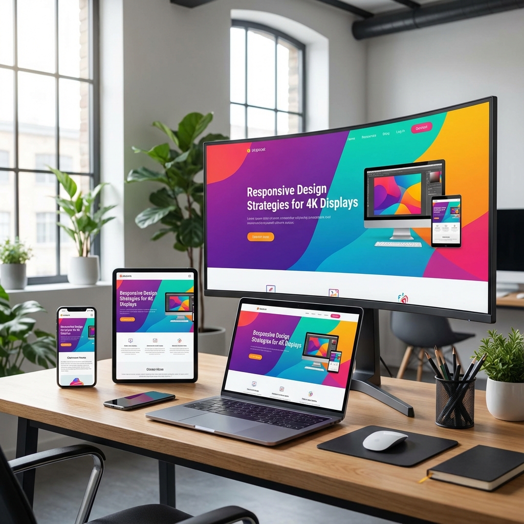
Tips for ensuring your website looks stunning on everything from small mobile screens to massive ultrawide monitors.
With the proliferation of high-resolution displays, standard 1920px designs are no longer enough. We must build layouts that scale gracefully.
### 1. Container Queries
Unlike Media Queries which look at the whole screen, Container Queries look at the size of the parent element. This makes components truly reusable regardless of where they are placed.
### 2. Fluid Typography
Use `clamp()` in CSS to define a font size that grows and shrinks smoothly between a minimum and maximum value, avoiding the jumpiness of multiple breakpoints.
### 3. SVG Assets
Always use SVGs for logos and icons. They are infinitely scalable and have zero quality loss on Retina or 4K screens.